
Match.com Rebrand
Match.com is one of the leading online dating websites, with decades of experience within the online dating realm. It uses location services as well as computer data to create matches for people depending on who they are and what they are looking for. With the rise of app-based dating services, Match.com has lagged a bit in terms of modern design, look and feel. While they have started updating parts of their brand, it is not cohesive and it is easy to land on web pages or app screens that look like they were designed in the 1990’s. The goal of this project was to freshen up the look of the brand while emphasizing the benefits of what a paid dating app can offer to its subscribers, which is an upscale, reliable and exciting experience.
Category
Print, Digital, Packaging, Branding


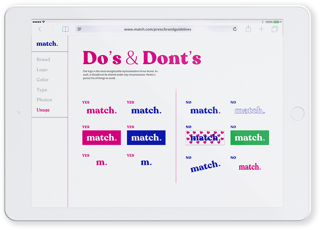
When looking at competing dating apps, many are going for the fun and quirky approach to online dating, targeting a younger audience. The Match.com brand was shortened to Match, and the subtle calming blue of the original brand was switched with a bolder, more upbeat indigo blue and a bold magenta was added to liven up the feel. Recoleta was used throughout the brand logo and copy to tie in the curvy lines of the heart, with a fun, flirty serif. Alegreya Sans was used as a secondary typeface to use for copy, but still adding those curvy, interesting lines. Photos were lightened or treated with duotone to add fresh color throughout the brand.


